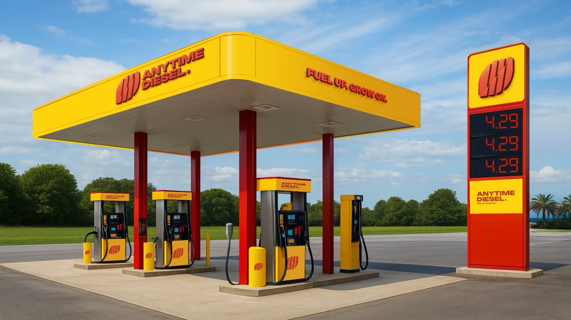
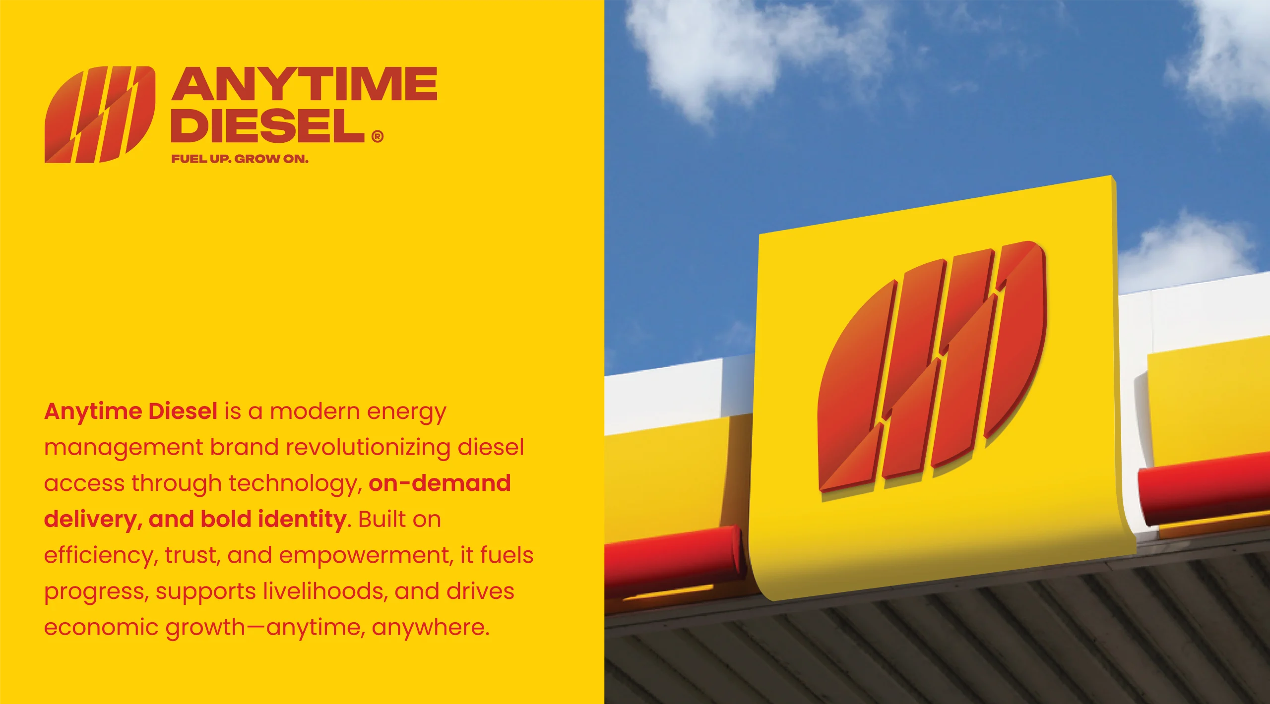
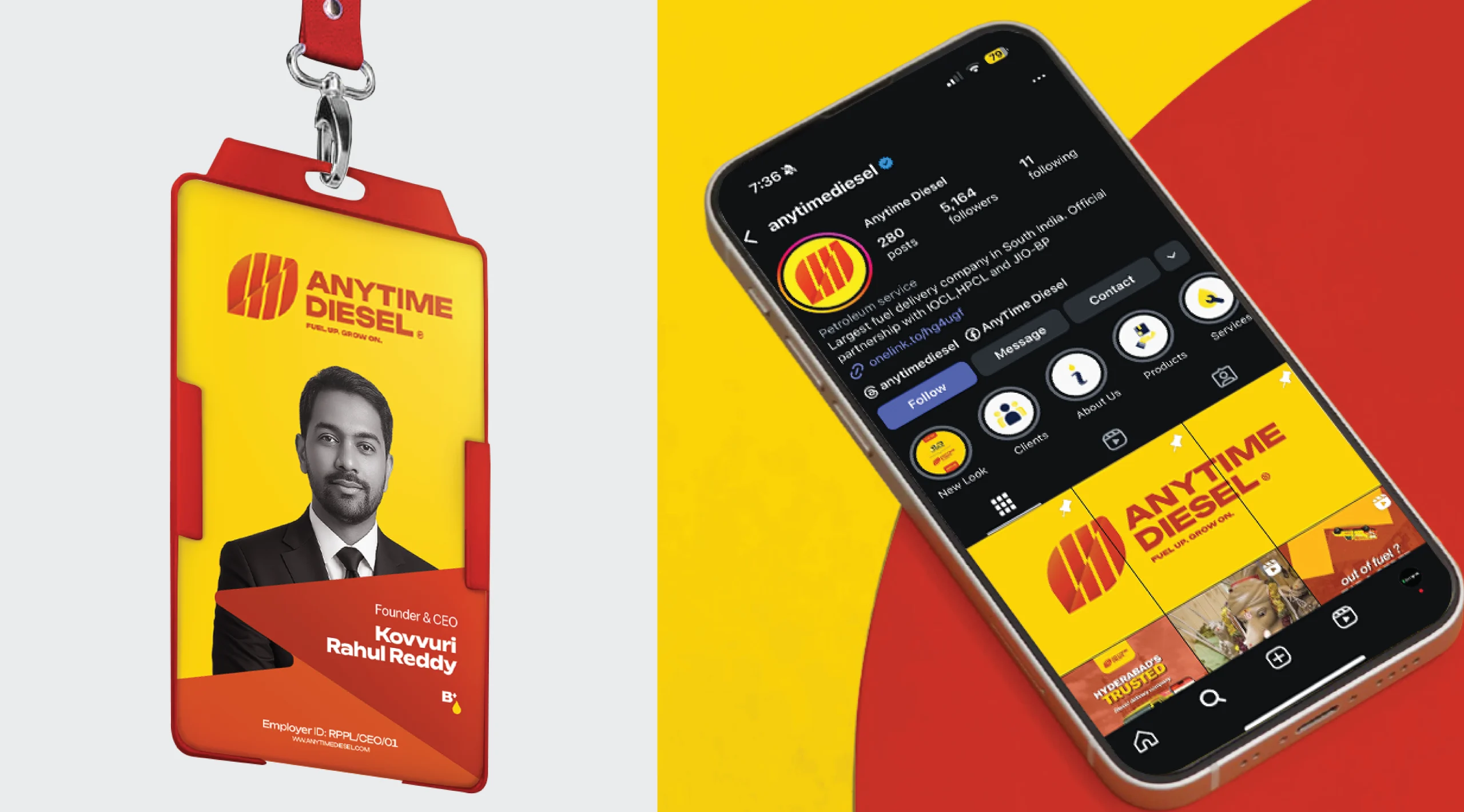
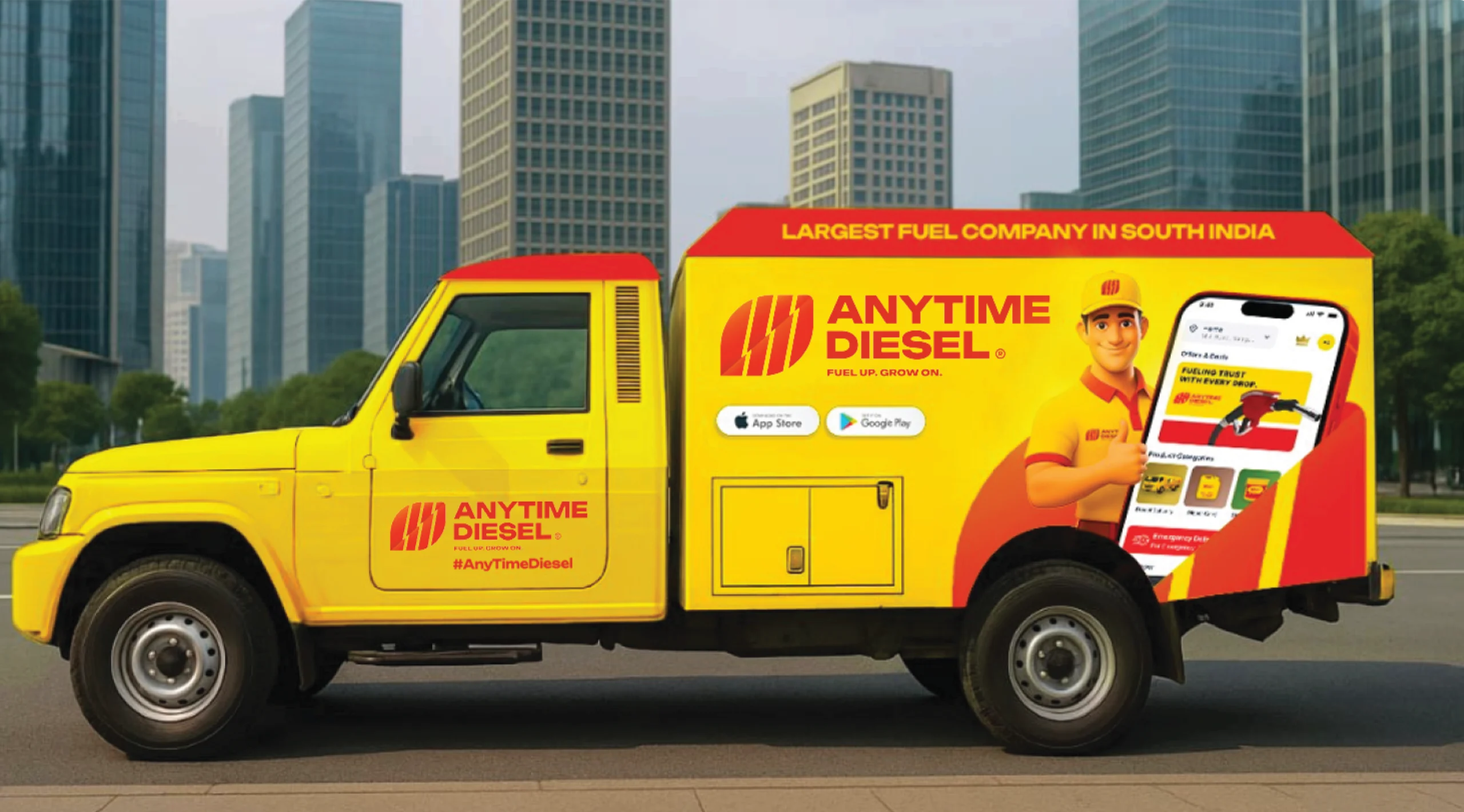
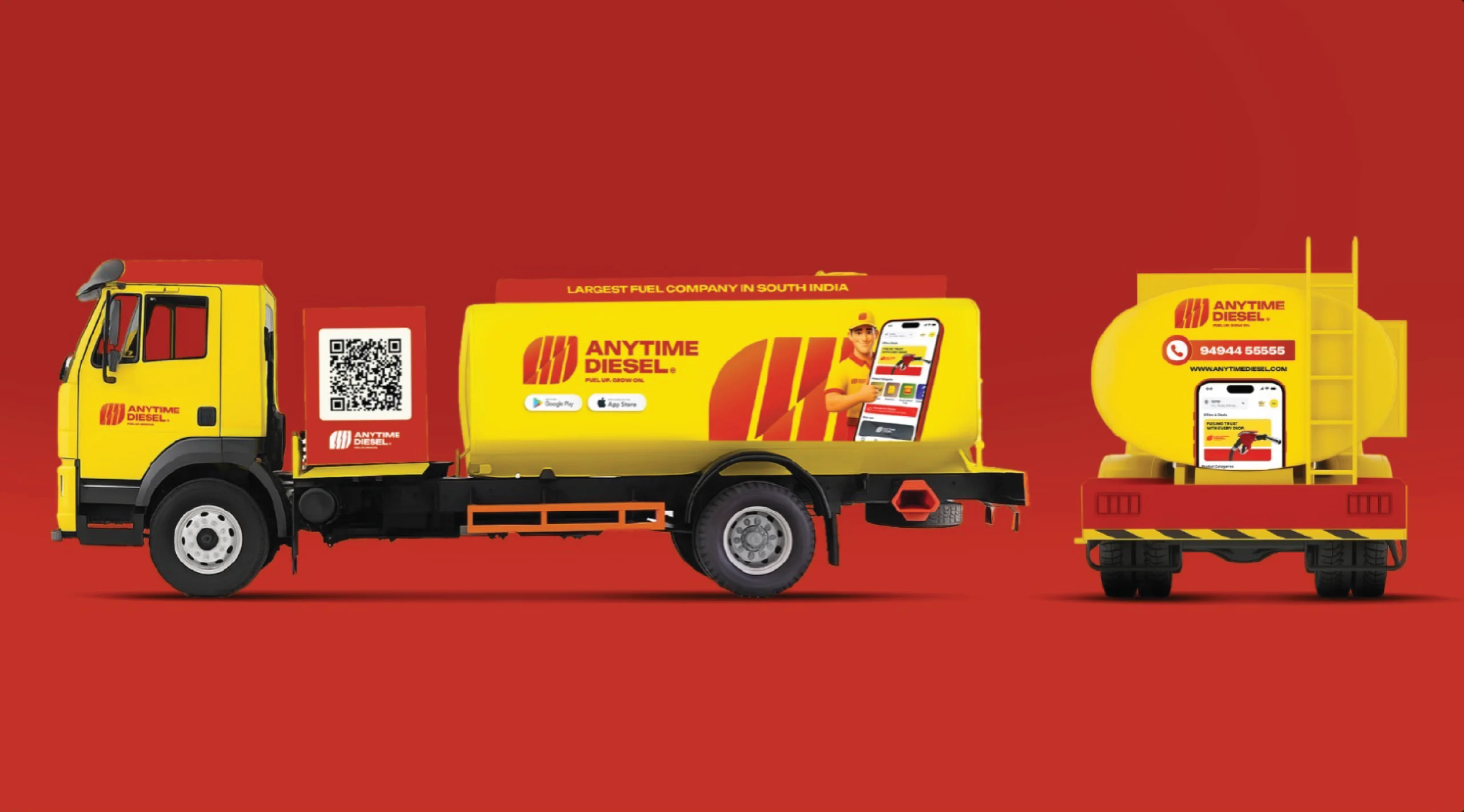
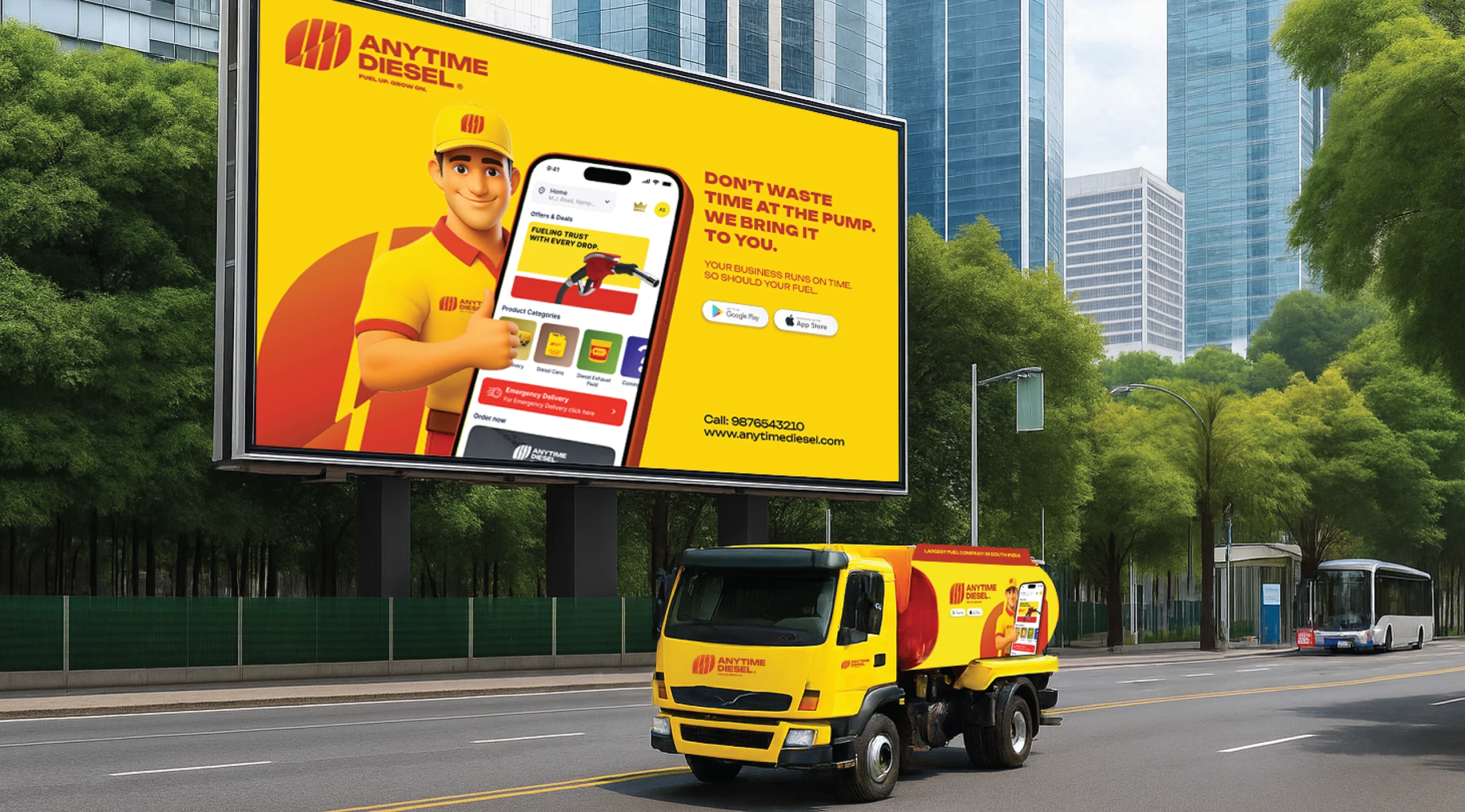
Earlier branding lacked consistency and modern appeal, limiting recall and connection. Vehicles, communication, and visuals appeared fragmented. The challenge was to craft a cohesive, professional identity that communicates trust, speed, sustainability, and accessibility across both on-ground and digital touchpoints.
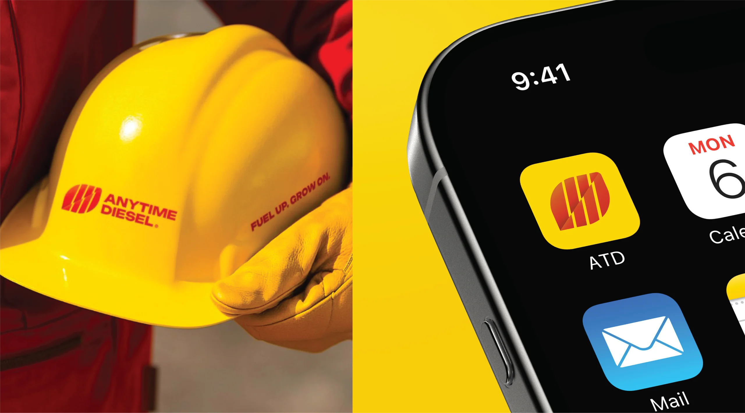
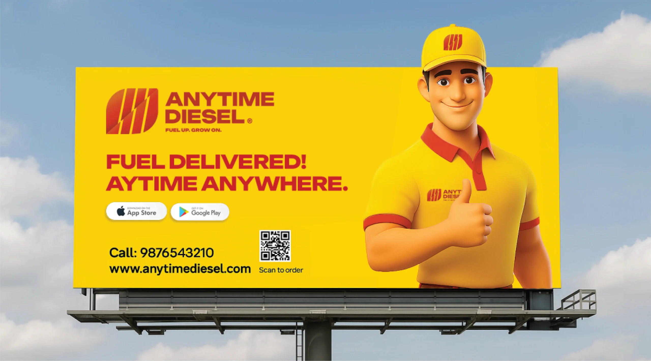
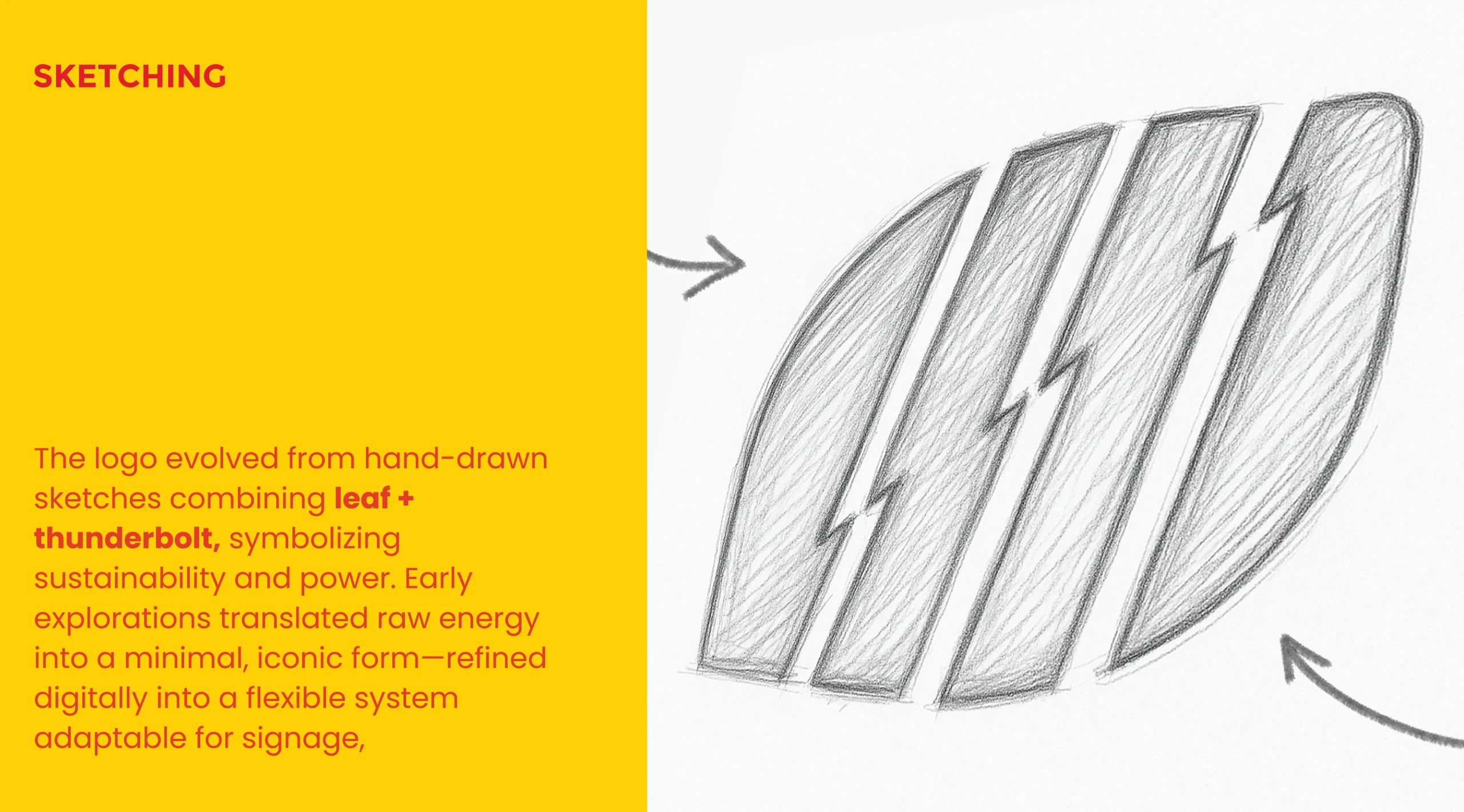
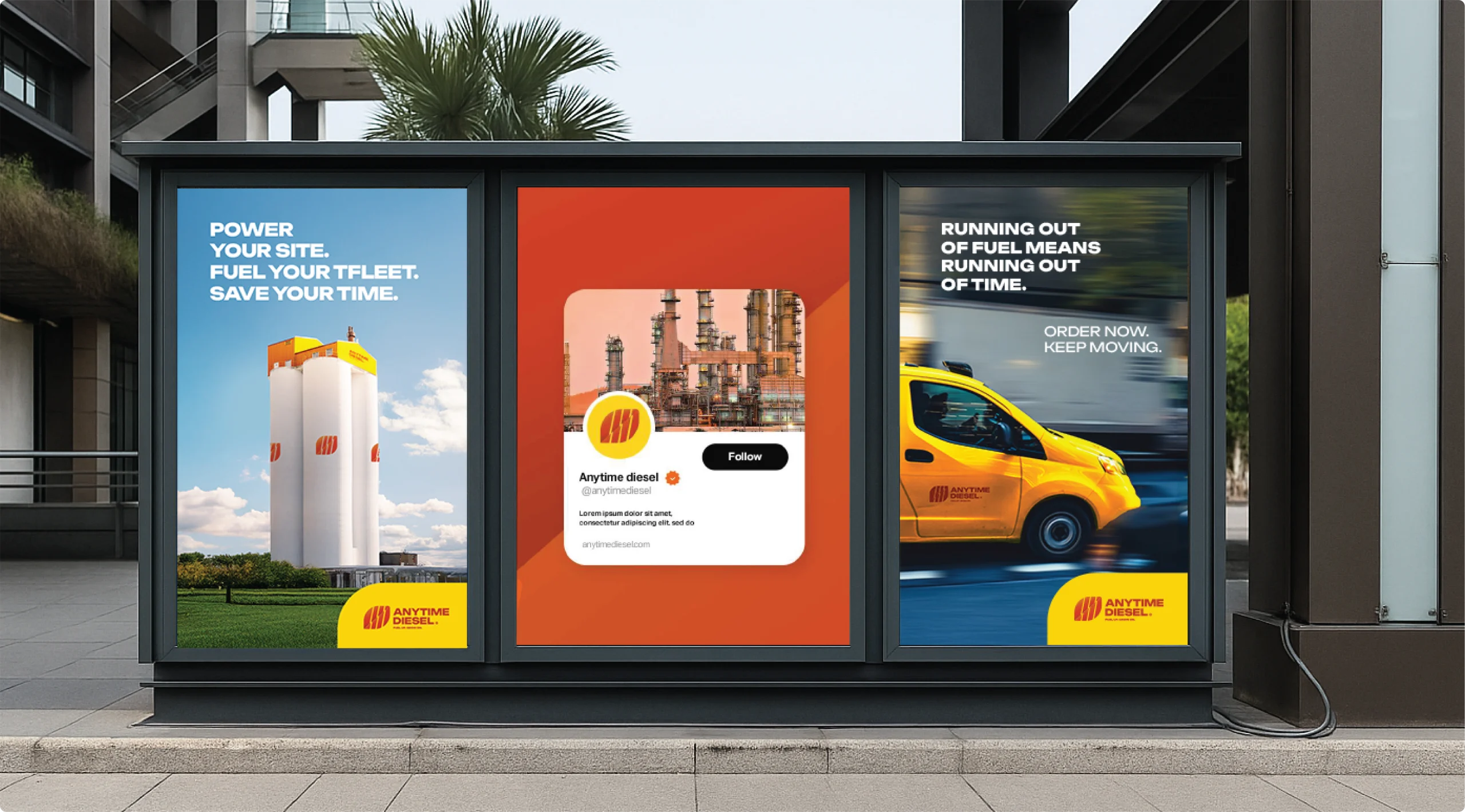
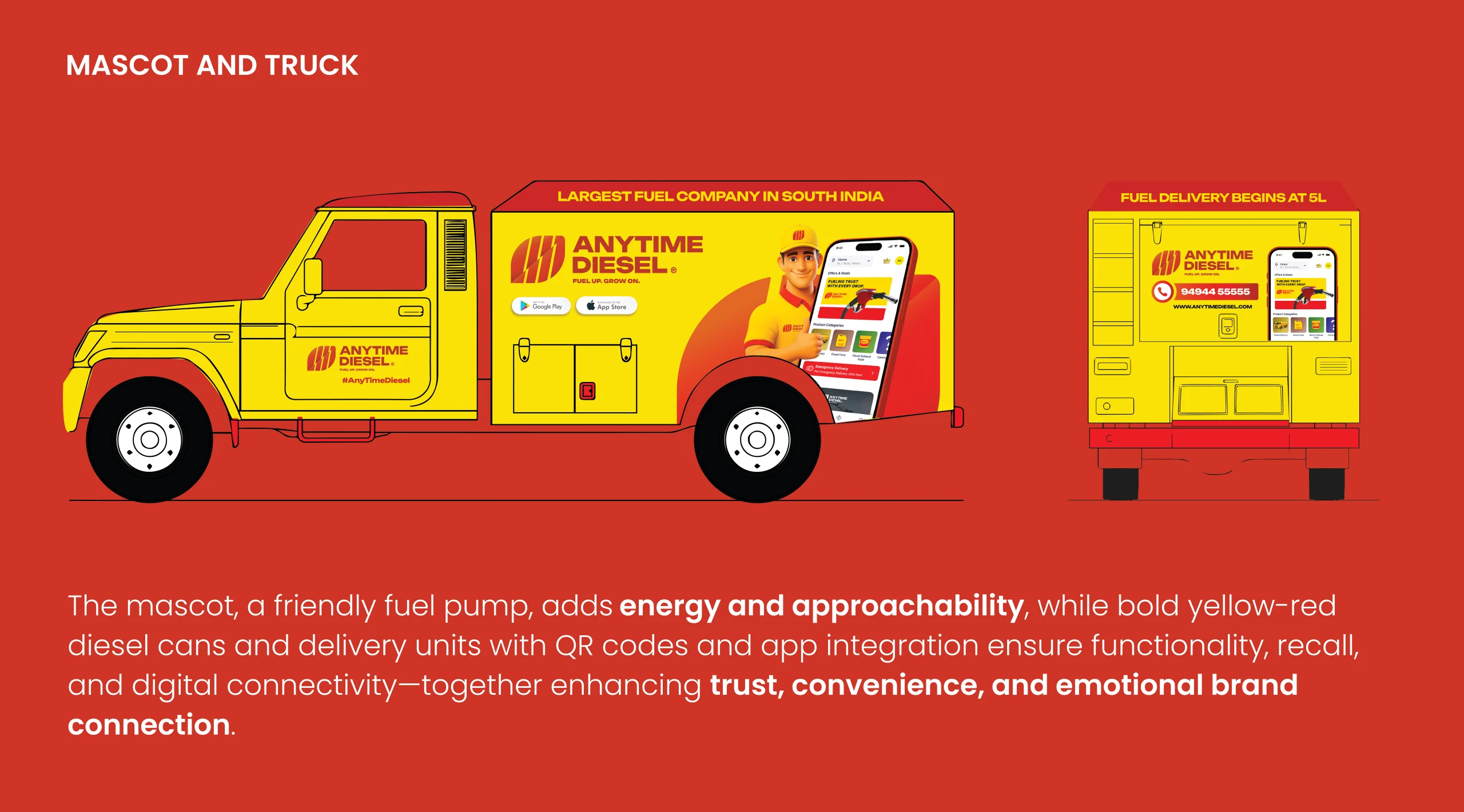
We designed a vibrant, consistent visual system blending red and yellow for energy and reliability. A dynamic logo fuses power and growth, supported by
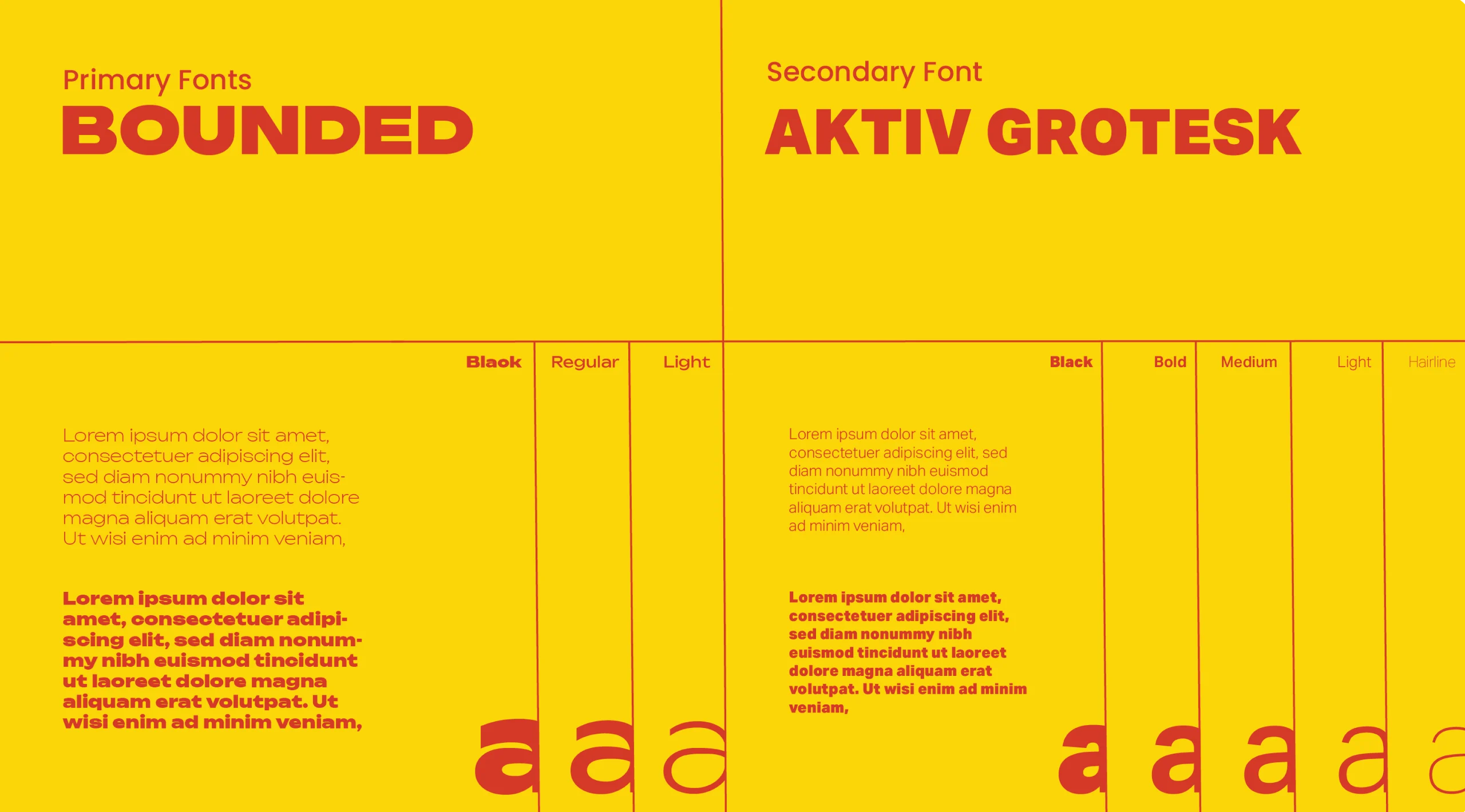
refined typography, iconography, and digital presence—delivering a seamless, recognizable brand across stations, fleets, apps, and campaigns.