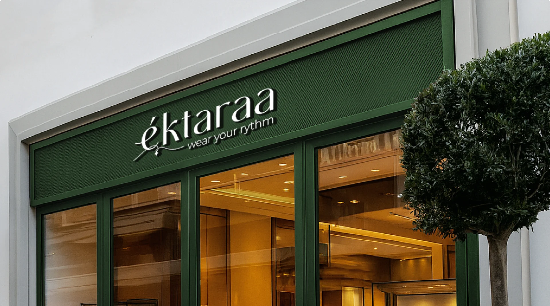
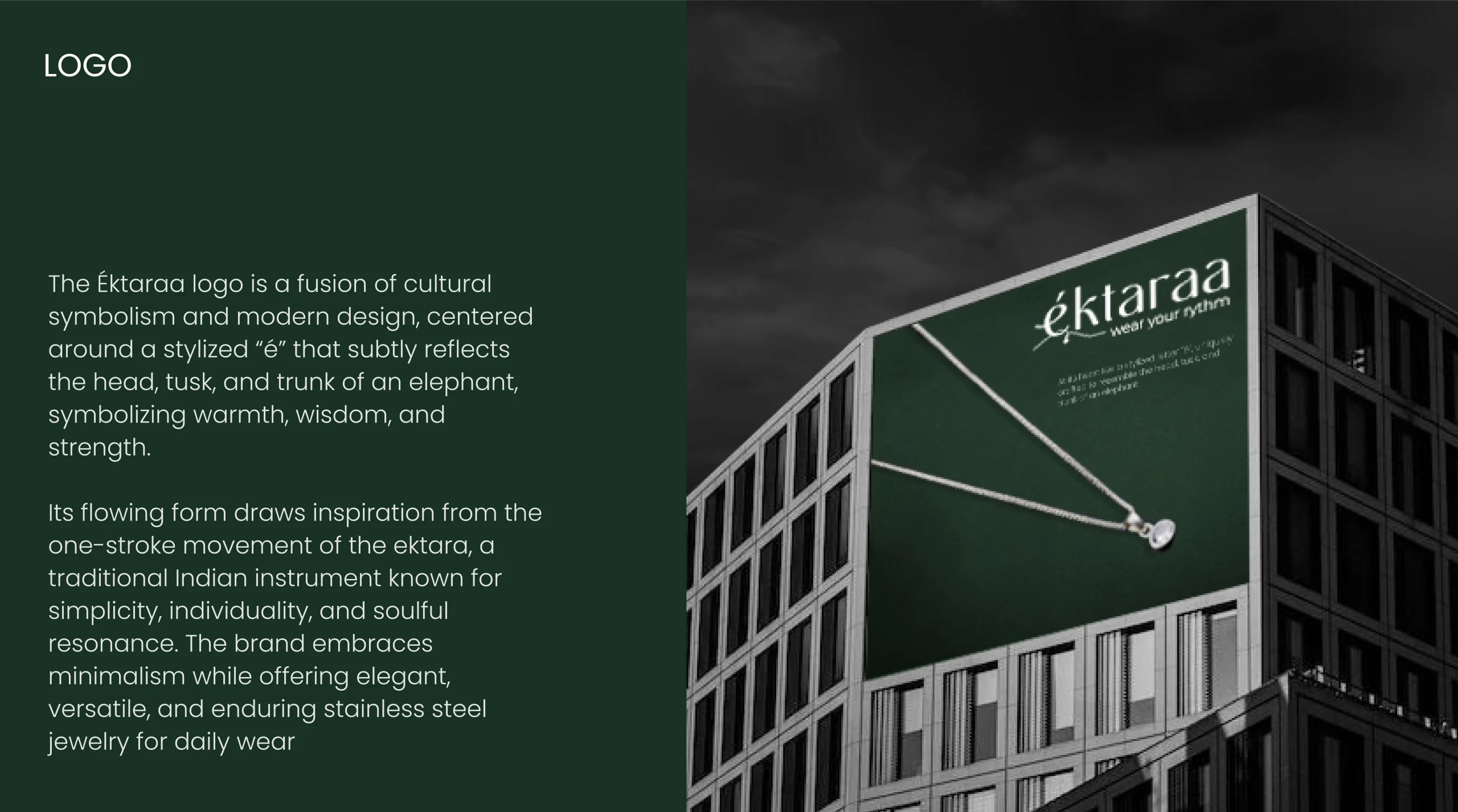
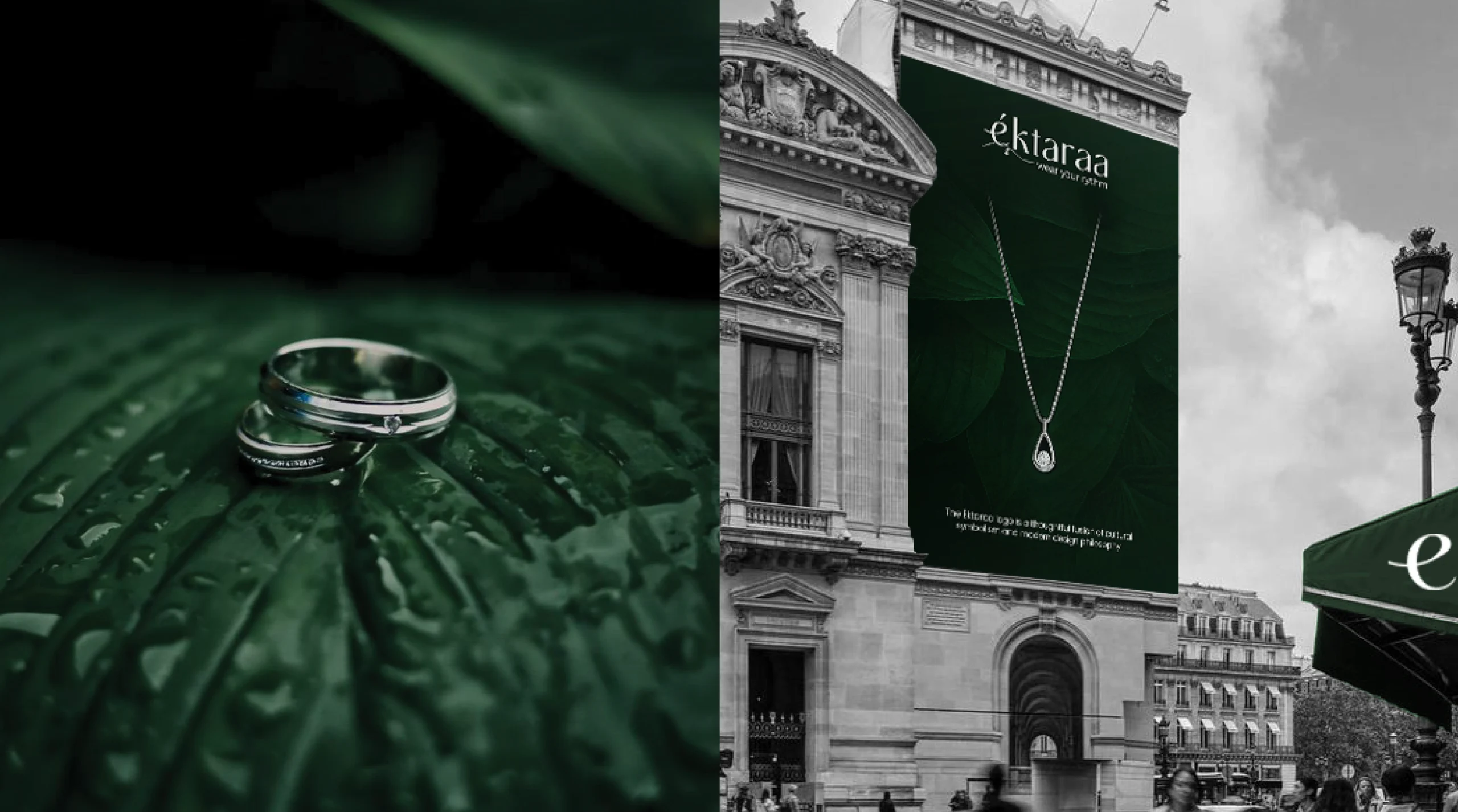
The primary challenge was to craft a brand identity that felt culturally rooted yet globally relevant. éktaraa needed to stand apart in a saturated jewellery market full of predictable gold tones, heavy ethnic motifs, and mass-market appeal. It wanted to be seen as premium, poetic, and personal — without
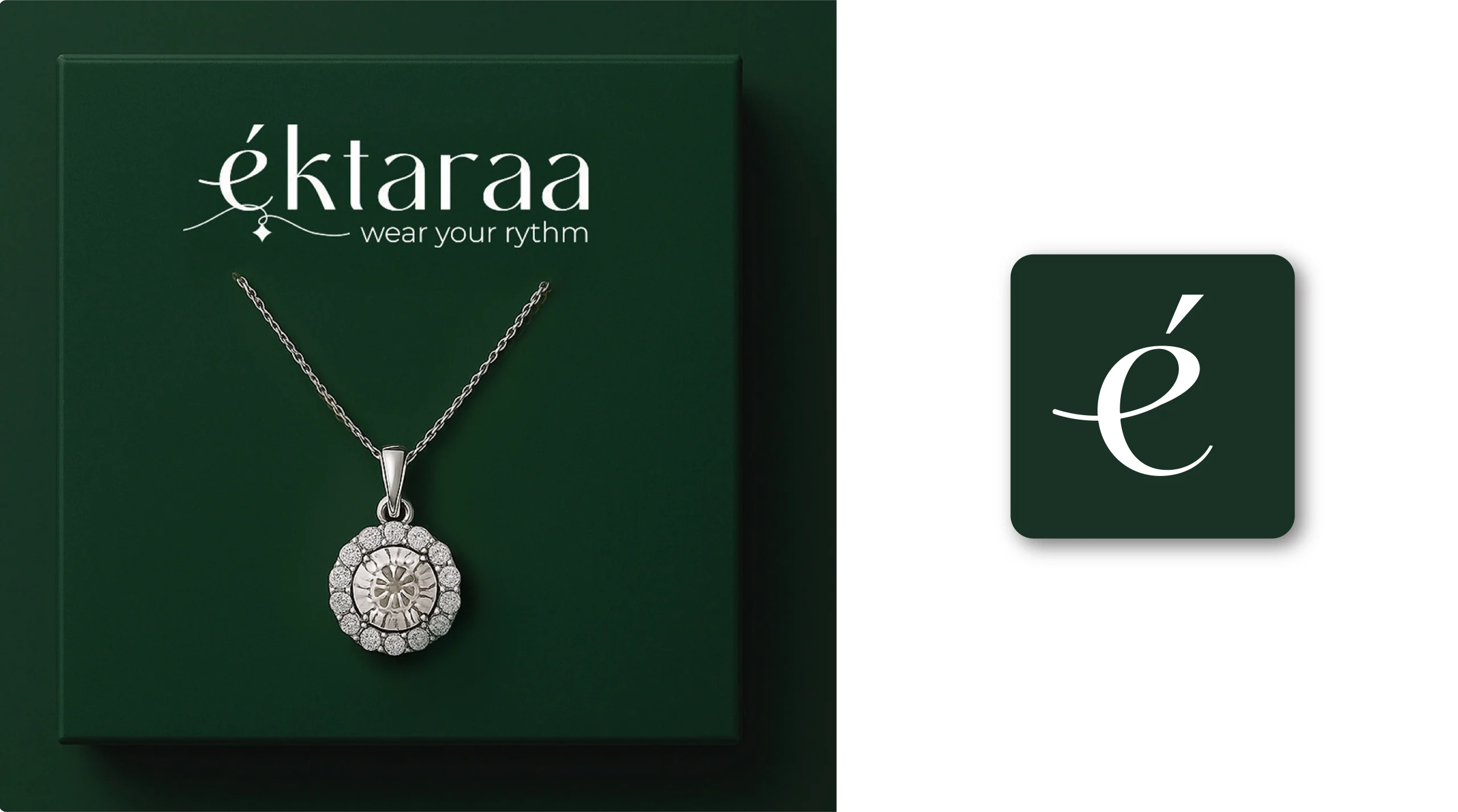
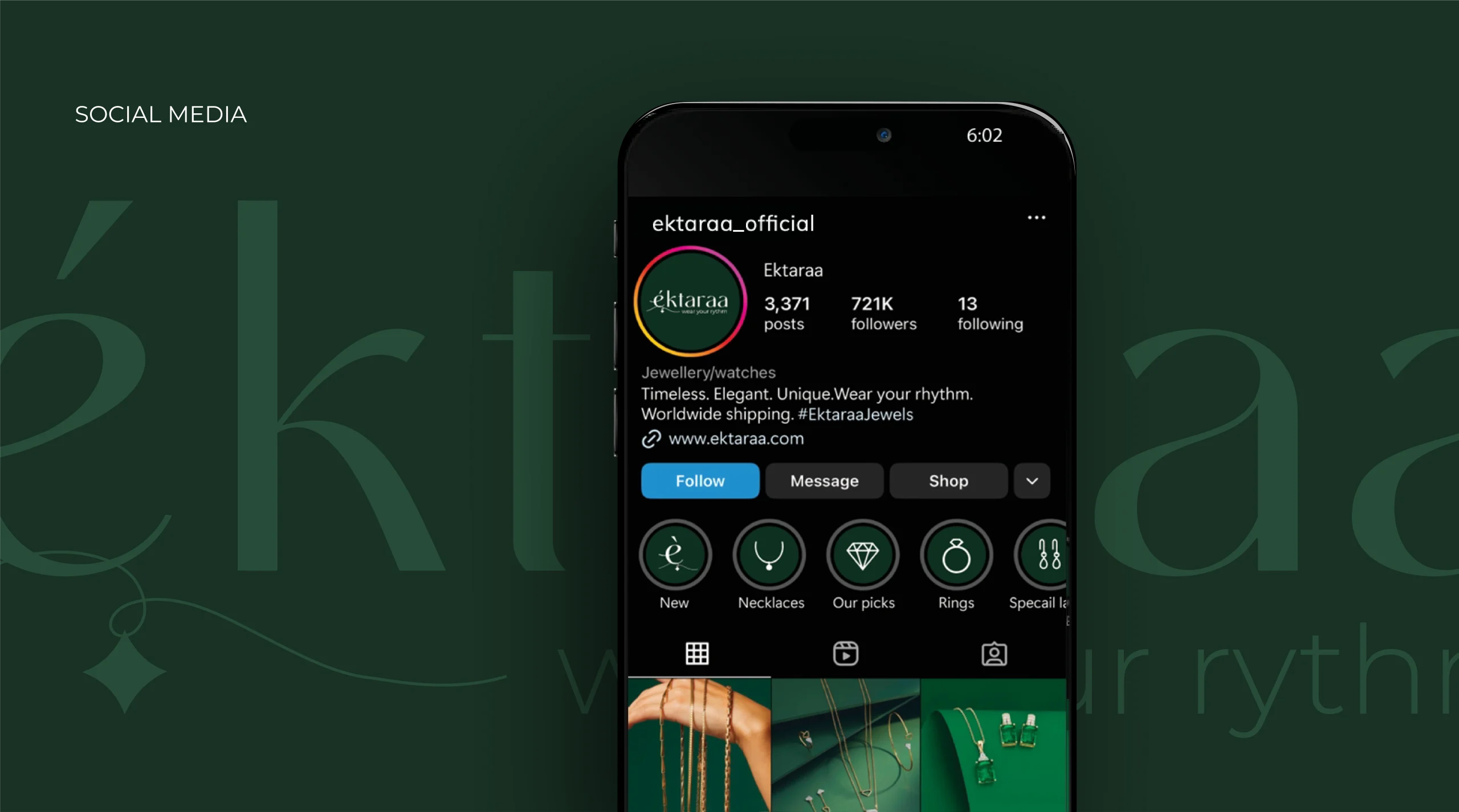
leaning too heavily on trend or tradition. The brand also needed its identity to function seamlessly across physical storefronts, packaging, and digital content
while retaining a unique emotional signature.
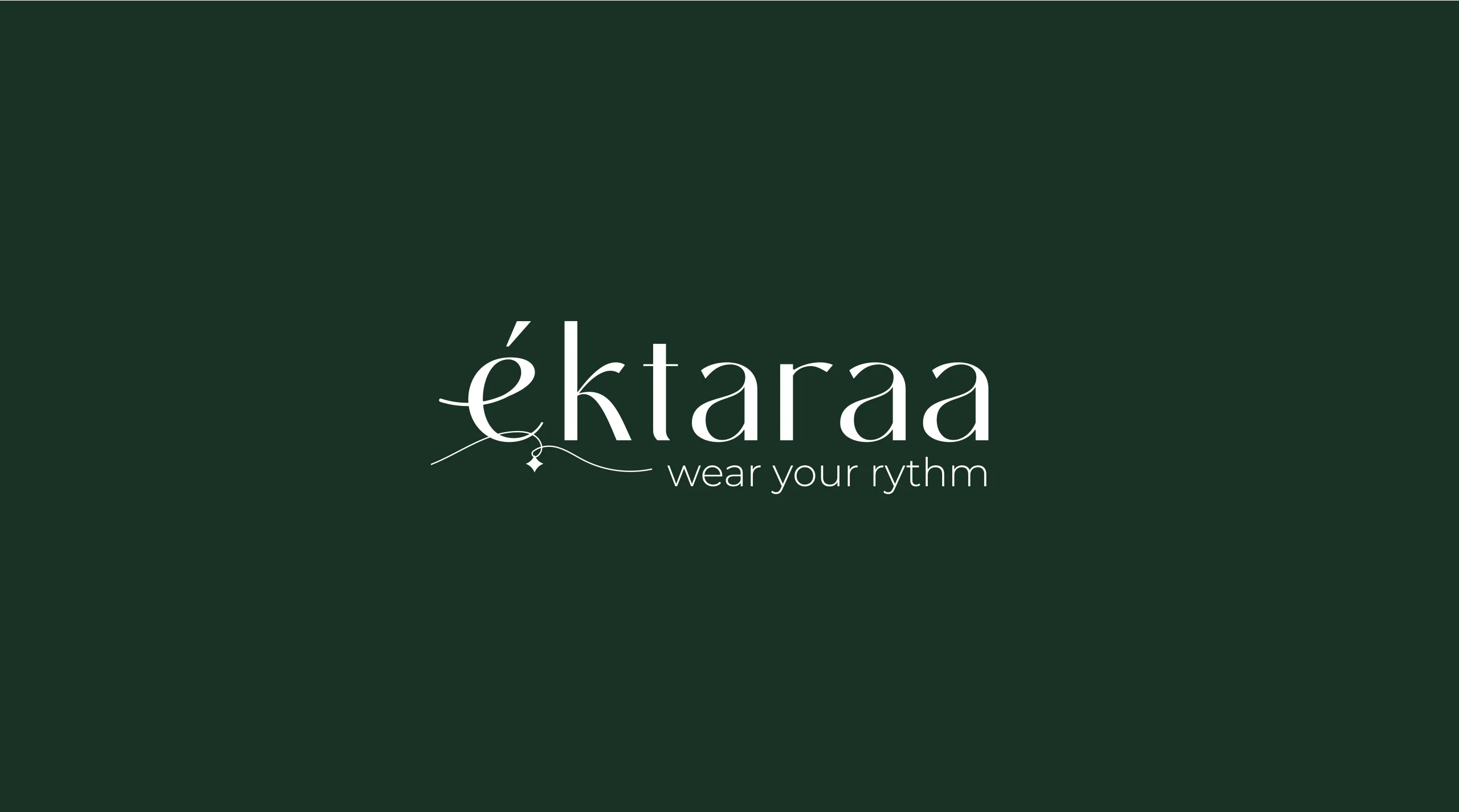
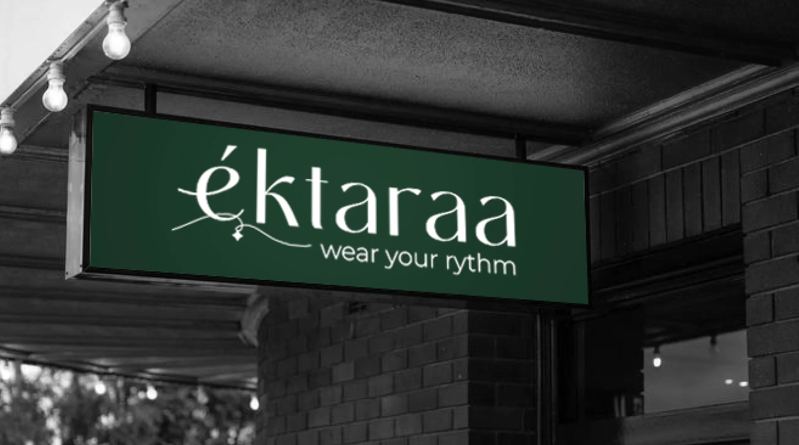
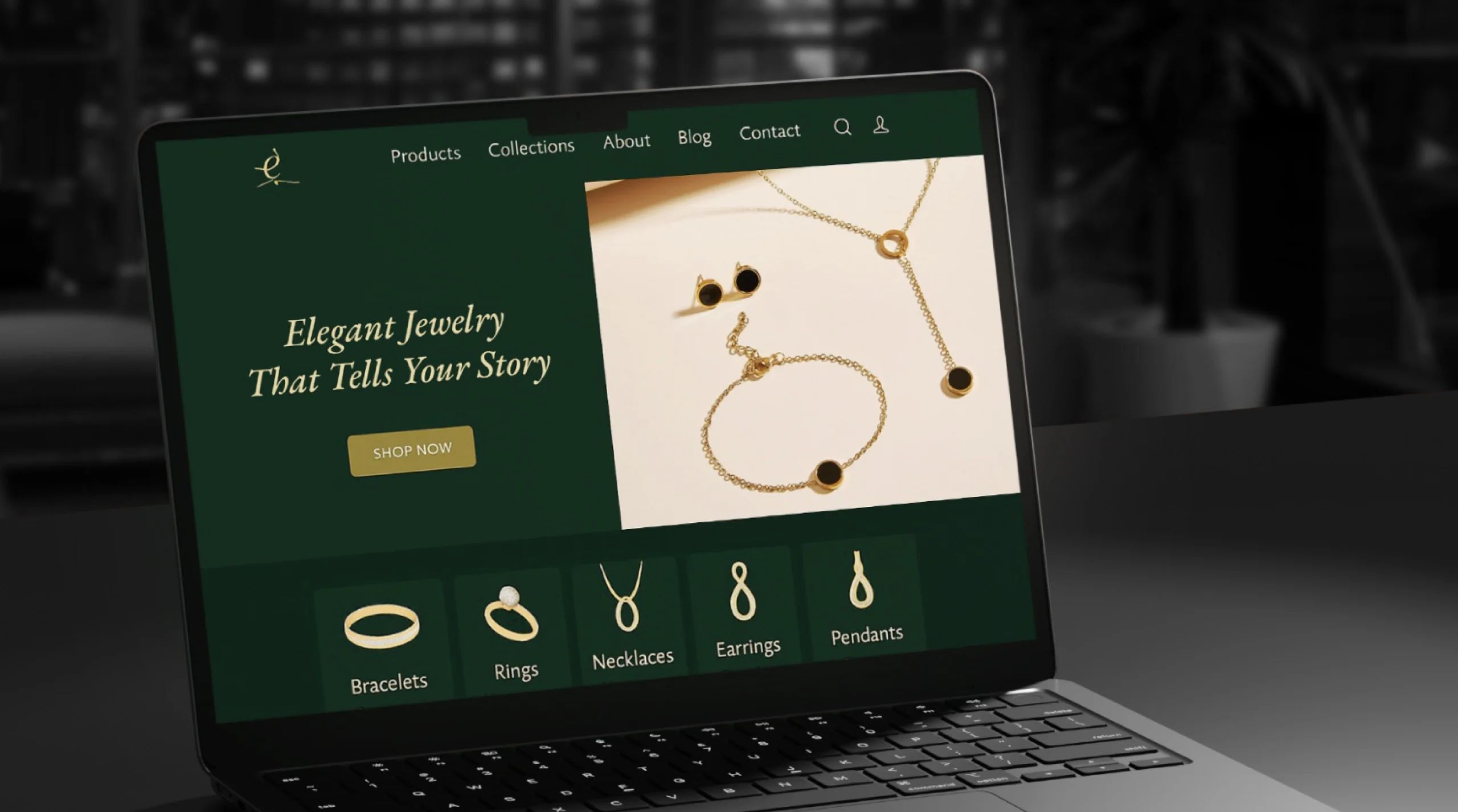
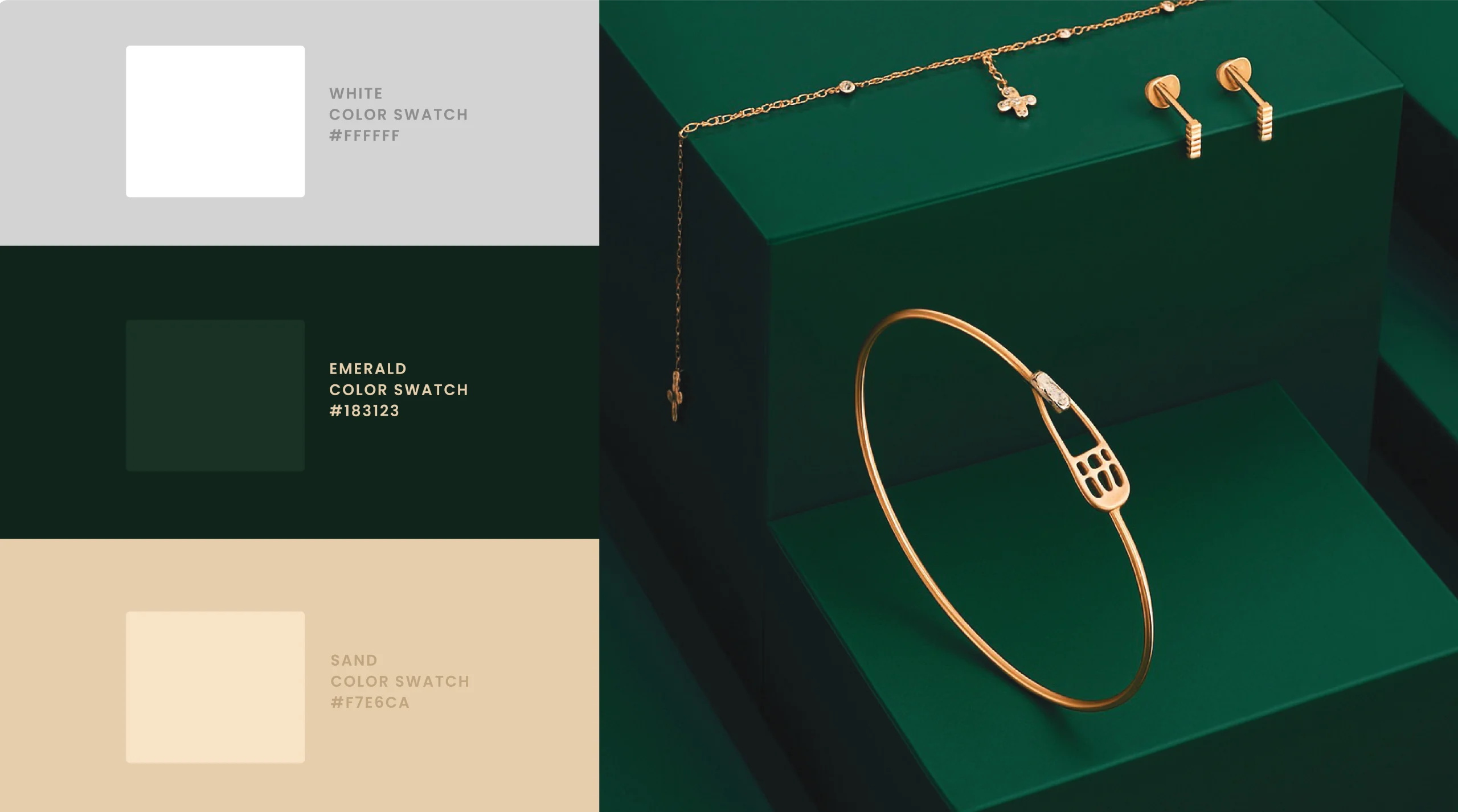
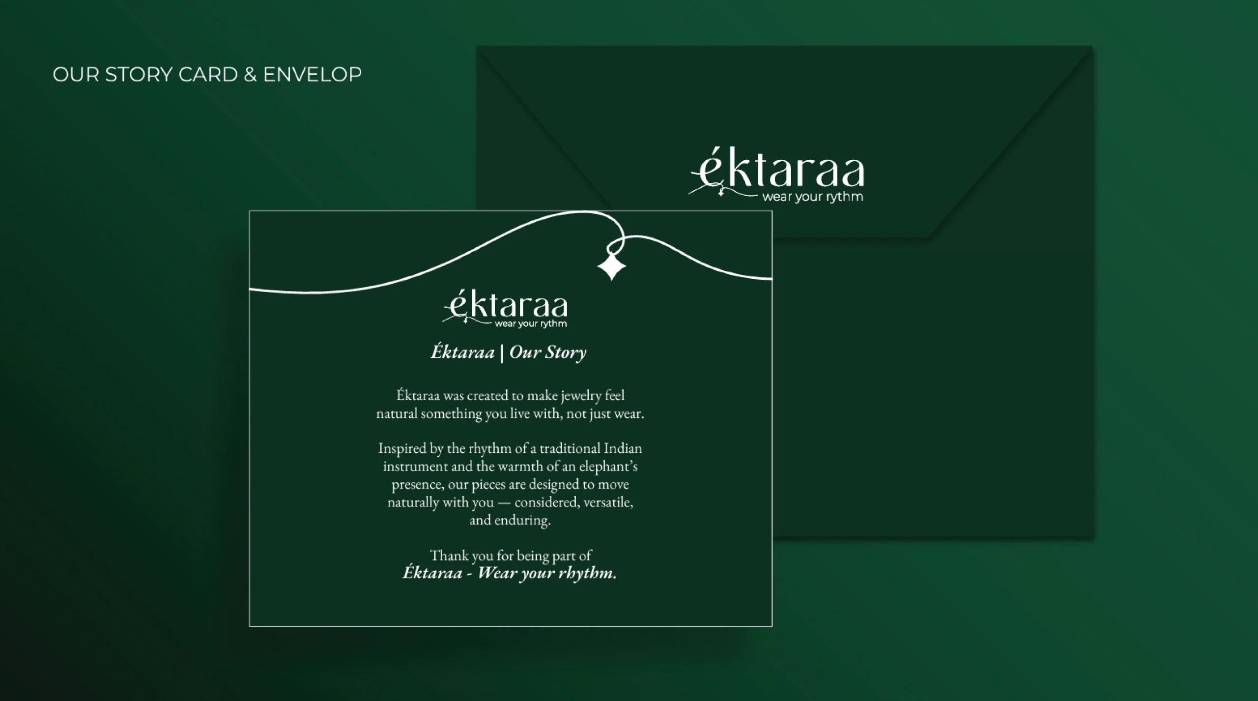
We built Éktaraa’s branding as a story-first experience — a mood, rhythm, and feeling one wears. Every element, from typography to color, reflects melody, movement, and cultural depth with calm confidence.